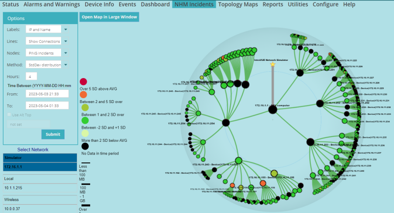
NHM Incidents Topology Map
The purpose of this map is to show where in the network the worst performing devices are located.
This map is similar to the other WBC Network Health Monitor maps. From the controls on the left you can select which network to map, select label options, and line color options.
The Nodes dropdown selects between PING, RECV, and XMIT statistics.
The Method dropdown currently has 2 options with more planned:
- StdDev distribution - which color codes the devices according to how many standard deviations they exceed their average for the period selected.
- Even distribution - which has an equal number of devices in each of the 5 color coded categories.
Changing the network selection will change the map.
After changing any of the upper control values you need to select Submit to see the results.

| Introduction |
|
| Key Features and Benefits |
|
| Getting Started |
|
| Update Intravue |
|
| Notes on User Interface |
|
| Configuration |
|
| Connecting to an IntraVUE |
|
| WBC Network Health Monitor Settings |
|
| Email Settings |
|
| Database Settings |
|
| Real-Time IntraVUE Management |
|
| IntraVUE Status |
|
| IntraVUE Dashboard |
|
| Summary Statistics |
|
| Highest Ping Response Devices |
|
| Highest Bandwidth Devices |
|
| Uptime and Statistics |
|
| Hypertree Network Map |
|
| Tree View Network Map |
|
| Reports |
|
| Device Info |
|
| Alarms and Warnings |
|
| Events |
|
| Threshold Analysis and Configuration Report |
|
| Time Based CRC and IfInErrors Report |
|
| Connection History Report |
|
| 1 Week Disconnected Devices Report |
|
| Disconnections by Minute Chart |
|
| Ping Failures by Minute Chart |
|
| Switchprobe (analysis) Reports |
|
| Utilities |
|
| Device Editor |
|
| KPI Management |
|
| Create a 'clean' database with existing ranges |
|
| Vendor Name Management |
|
| DeviceInfo Popup |
|